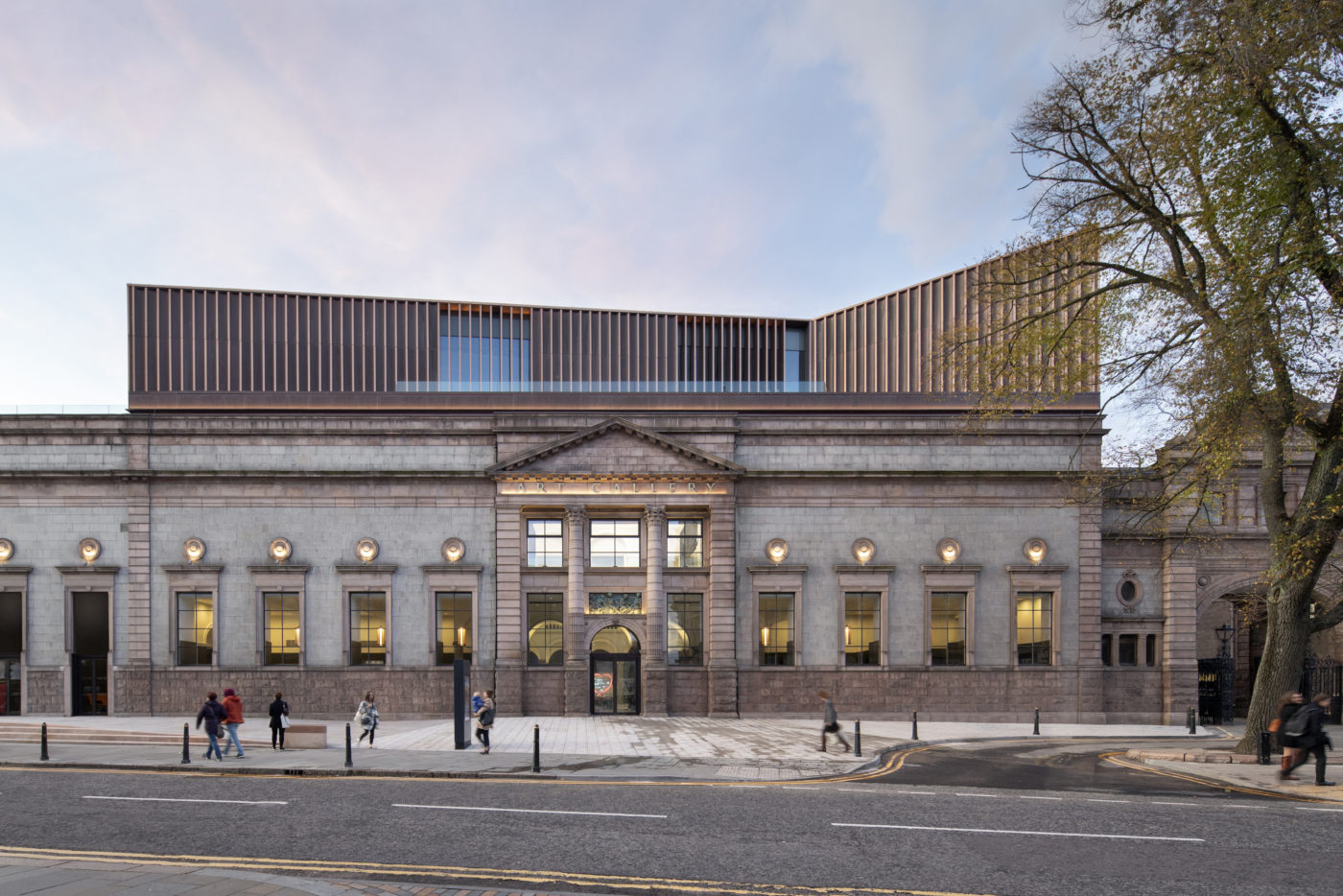
Aberdeen Art Gallery - The Architects' Perspective
In November 2019 Aberdeen Art Gallery reopened it's doors to the public after a comprehensive redevelopment. In this piece HA director Nick Van Jonker, involved from the early stages of the project, outlines the issues that engendered the redevelopment, the process followed and the ideas at the core of the redesign.
Introduction
Hoskins Architects is a leading European practice with studios in Glasgow and Berlin, and a strong reputation for the creative redevelopment of public museums and galleries. The practice has delivered major projects for international cultural institutions, including the National Museum of Scotland, the V&A, Weltmuseum Wien and the Scottish National Gallery. Hoskins Architects was appointed to the redevelopment of Aberdeen Art Gallery in 2009, and the completion of the project in 2019 is the culmination of a decade of intensive, creative and collaborative work with Aberdeen City Council; the team at the Gallery; a wide range of internationally respected consultants and specialists; and funders, stakeholders, contractors and visitors.
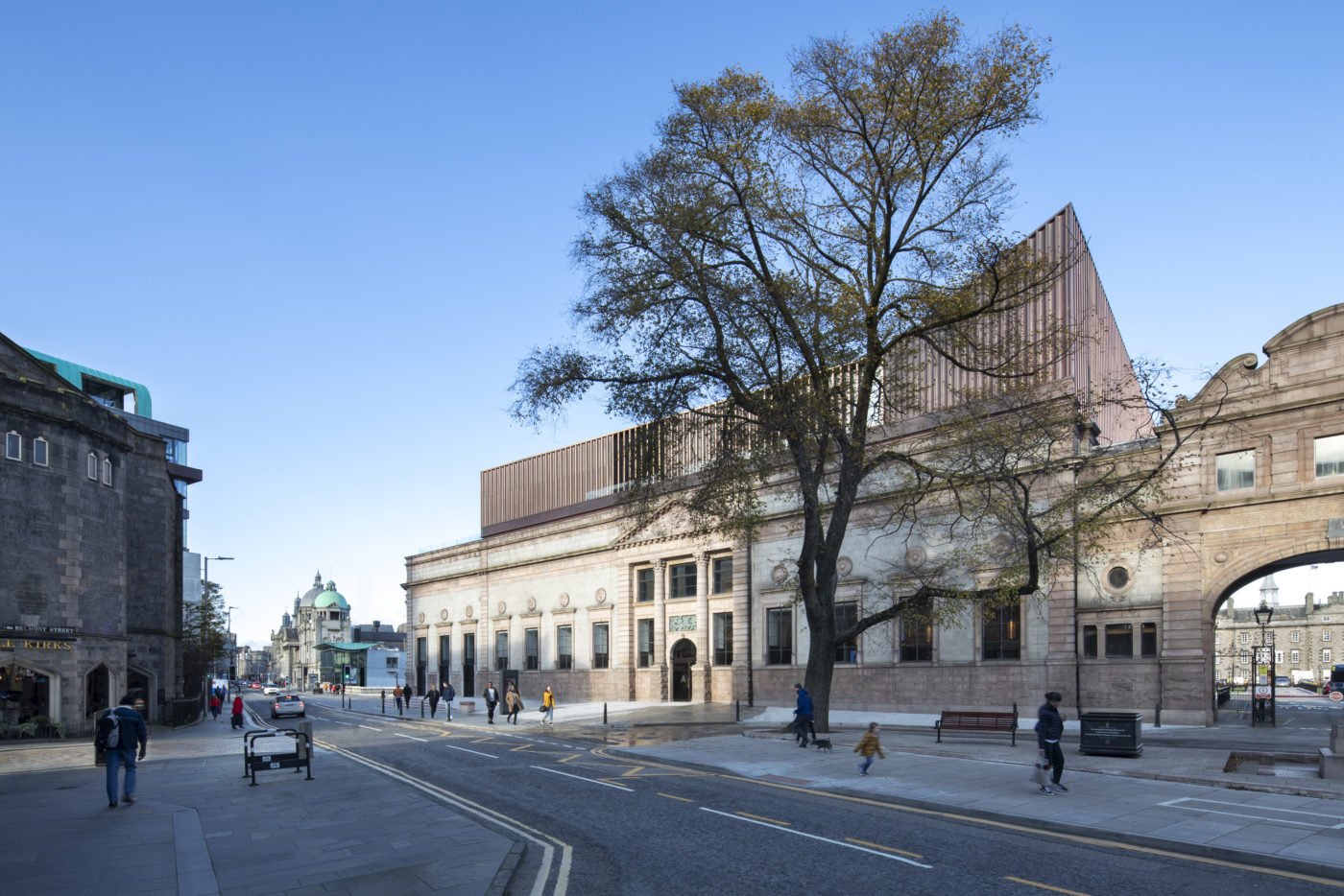
The project delivers major new exhibition and education spaces; greatly improved visitor facilities, wayfinding, accessibility and circulation; a complete renewal of servicing and environmental control systems; and dramatically improved art handling, storage, back of house, and study facilities. The special character of the original spaces has been repaired and their clarity reinforced, and a prominent new copper-clad rooftop extension signals the Gallery’s renewal to the city, and in turn offers visitors a new perspective on Aberdeen itself.
Background
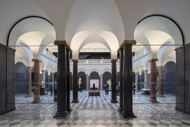
Founded in 1873, the Gallery occupied a building complex designed, then rapidly and substantially extended and modified between 1885 and 1926, by A Marshall Mackenzie. This process saw a relatively modest suite of rooms on the site of a former monastery develop into a major complex of picture galleries, a grand sculpture court, a war memorial, and the Cowdray Hall - a medium-scale recital hall with a celebrated acoustic for chamber music. The Gallery’s collection, building on major gifts and bequests, is outstanding. It has depth and breadth across fine art, craft and design, and an extraordinary range of internationally significant work including an inspiring and growing contemporary collection. By 2009, the category A listed building complex no longer met the demands of the institution or did justice to the collection, and was failing to fully engage visitors and the wider public.
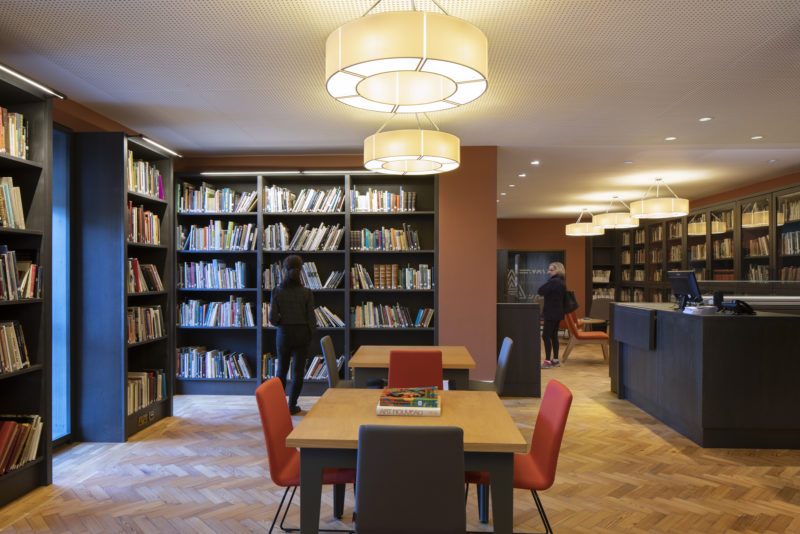
The challenges which the Gallery faced by 2009 were varied. Some were essentially a function of failing building fabric and systems – myriad leaks, uncontrolled airflow, poor control of environmental conditions, and end-of-life mechanical and electrical installations. These compromised the institution’s ability to look after its collection and attract major loans or touring exhibitions. Other challenges related to inadequate art handling facilities – poor access and a lack of dedicated storage and handling spaces for temporary install meant prolonged closures to significant parts of the gallery to facilitate the temporary exhibitions programme, and an ad hoc approach to environmental control, blackout, and ticketing for temporary shows. A further category of challenges related to accessibility, circulation and perception. Not only was there no accessibility to the upper levels of the complex for visitors unable to use stairs, a majority of visitors simply did not venture to the upper levels as a consequence of the lack of intuitive wayfinding and clear circulation. Compounding this, the Gallery’s physical presence on Schoolhill was somewhat mute and unwelcoming – it offered no view to the treasures within, nor did it communicate its status as a major public institution to visitors or passers-by. For those who did venture in, the visitor facilities were of poor quality and outdated, with tired and cramped shop and café spaces, and no centralized welcome point, cloaks or box office for the Cowdray Hall.
In addition to solving the various operational and physical problems which the complex exhibited, there was a pronounced ambition to dramatically improve the scale and quality of its cultural activities. More gallery space was required to show more of the collection; major new dedicated temporary exhibition spaces were required to attract international touring exhibitions to Aberdeen; new education suites to improve outreach and engagement programmes were to be added to the brief; and a flexible range of inspiring and welcoming spaces for functions or reception hire was identified as important.
Approach
In parallel with the brief development and business case work, Hoskins Architects undertook a process of careful research to enable a robust understanding of the existing building complex. This clarified the team’s understanding of the relative significance of the parts of the A-Listed complex, and offered new insights into the original architectural intentions, the historical context for the incremental alterations and extensions to the complex over time, and a clear view of the various compromises and detrimental impacts accumulated over a century of ad hoc modification and refurbishment. This work, and clarity on an emerging brief, allowed the team to crystallise a strategy with two main threads – one of careful repair and the other of confident addition.

- Repair
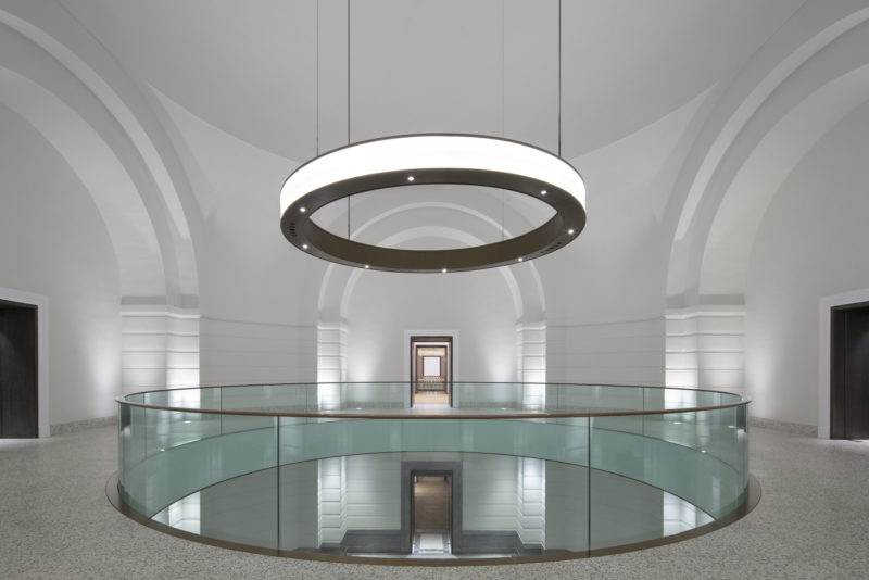
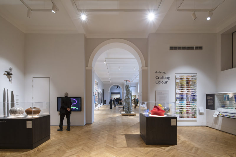
A programme of repair was focused both on making-good defective fabric and systems, and on addressing the damage done over time to the clarity of the original spaces and routes. A clear sequence of connections between galleries, and a clear hierarchy between the picture galleries and the Sculpture Court, had been lost as a result of uses other than the display of collections infiltrating these spaces. Stripping out these education, staff and temporary exhibition uses (and re-providing them on a greatly improved basis elsewhere in the complex), both freed up valuable gallery space for its originally intended use, and dramatically improved the balance and sequence of these spaces, as well as reinstating an intuitive circulation route through them. Critically, the Remembrance Hall, a dramatic and powerful civic space, was brought fully into the gallery circulation route and made accessible across two levels. Likewise, the Front Range, with inadequate toilets, unwelcoming café and shop spaces, and a poorly configured staircase, was cleared to create a welcoming, spacious, bright and visible entrance space offering clear views into the Sculpture Court beyond and properly connected public routes into the Cowdray Hall and Remembrance Hall. Throughout, a clear language of grey-timber portals emphasizes the transitions between spaces and celebrates the reinstated long views and circulation axes, as well as housing humidifiers, controls, and services distribution points to support the completely overhauled environmental control strategies. The renewed coherence of the original gallery spaces, supported by sensitive intervention and recalibration of circulation routes, is a major triumph of creative repair.
- Addition
Selective demolition allowed for the construction of a new ‘backpack’ to house improved staff, art handling, study and education facilities in effective, well connected, but deliberately low-key ancillary spaces located off the principal gallery circuit.
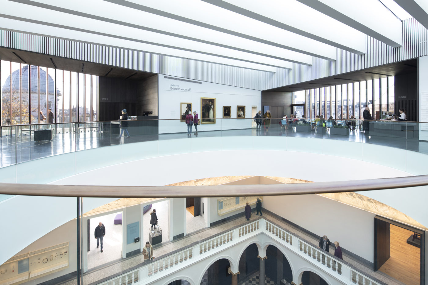
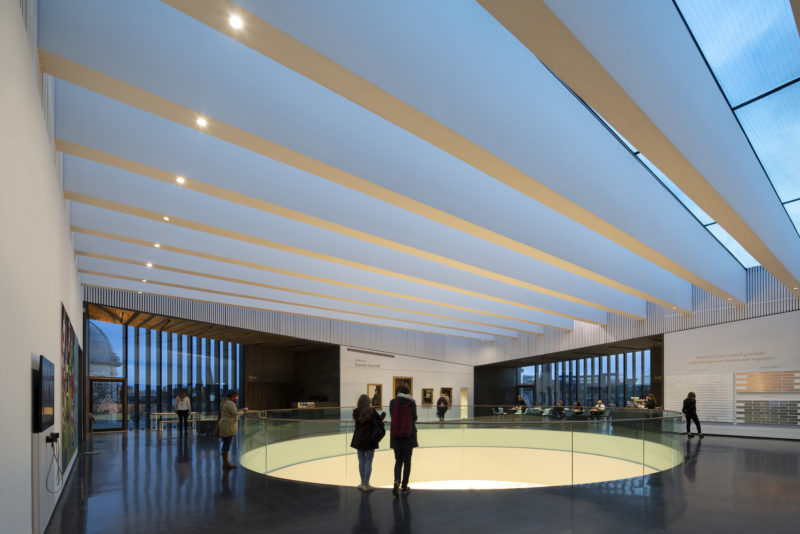
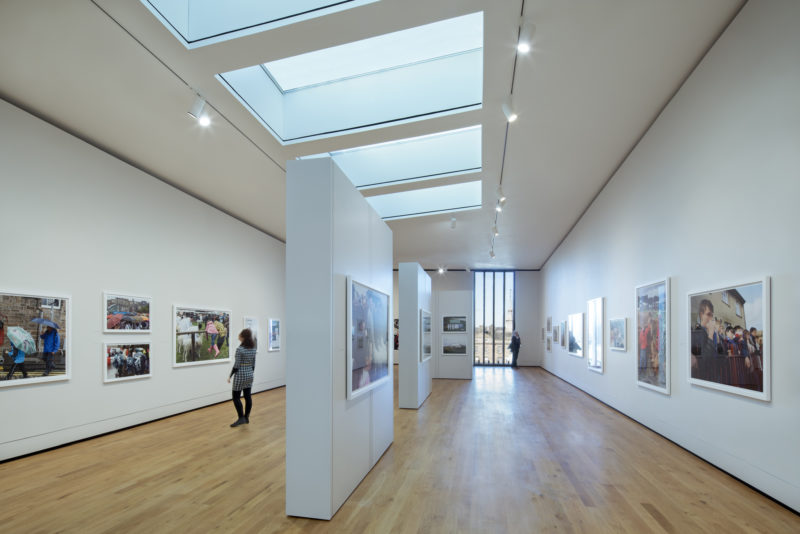
More dramatically, the entire roof, which surveys had confirmed was in need of complete renewal in any case, was removed, and a new copper-clad element built onto the existing granite walls. This houses the new flexible, naturally-lit temporary gallery spaces, as well as new exhibition space overlooking the Sculpture Court, an education suite, and additional cafe facilities adjacent to the public roof terraces which offer extraordinary new views across the city. A dramatic new glazed roof allows natural light to flood into the Sculpture Court below, and connects the new and old spaces in a powerful but sensitive way. The roof light doubles as a thermal stack and is central to the natural ventilation strategy throughout the complex. Automated vents concealed behind slatted timber linings at high level allow tempered air to be drawn through the galleries below without the need for conventional air-conditioning.
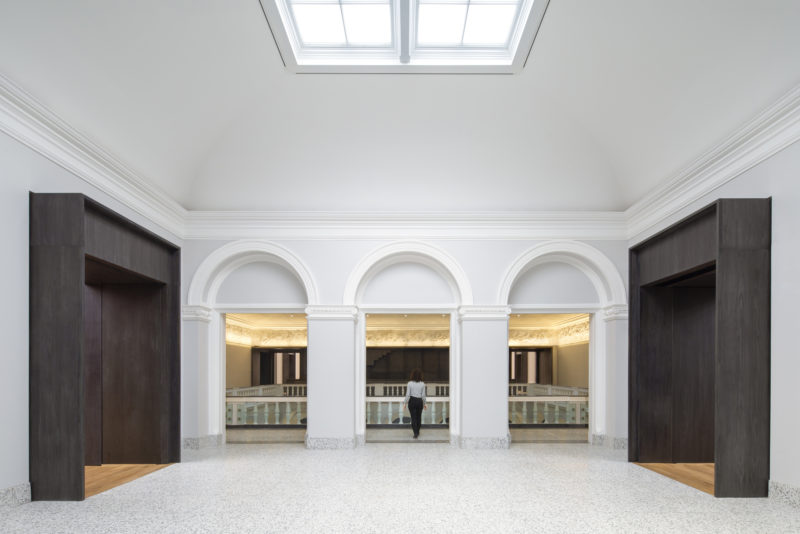
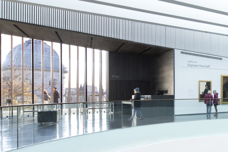
The grey timber portals, which elsewhere in the complex connect gallery spaces to each other, on the rooftop become room-sized thresholds between the central space and the city beyond – both framing important views and offering a place of transition between the exhibition spaces and the pair of roof terraces. A new staircase is driven through a slot formed on the edge of the Sculpture Court and cantilevered off a new wall. This intervention connects the three gallery levels in an intuitive way, and shares the grey-timber materiality of the other key interventions.
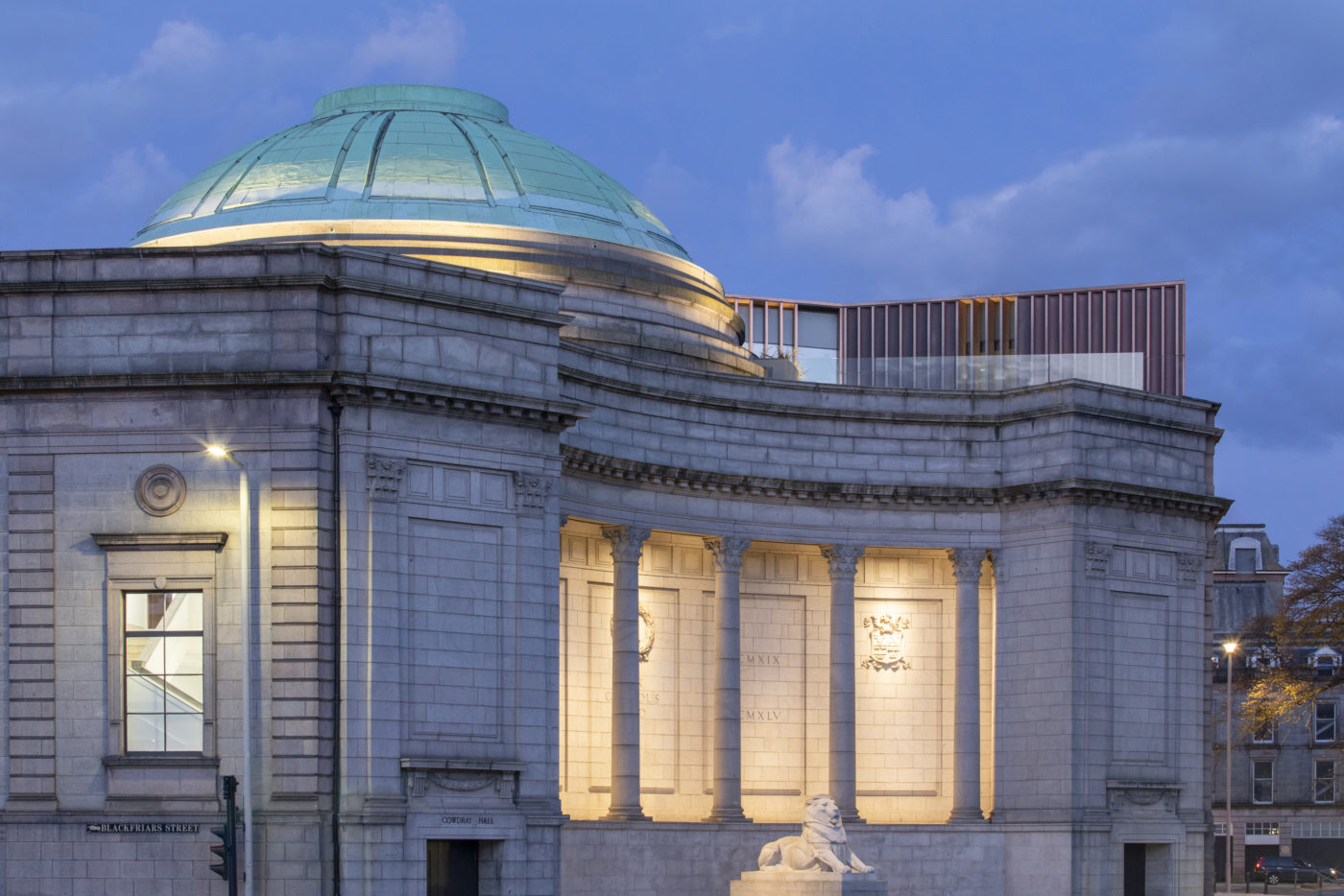
The rooftop extension establishes an elaborate dialogue with the adjacent Remembrance Hall dome. Its angular plan form and darting roofline are carefully calibrated in key views from nearby streets and from across Union Terrace Gardens, to offer a constantly shifting presence in relation to the granite of the Gallery walls and the green copper of the Remembrance Hall dome for those who move through the city. A gently scalloped profile, tested through numerous mock-ups and prototypes, is designed to catch the shifting northern light in ever-changing ways, and suggests in turns both a billowing skin and solid, cast, form.
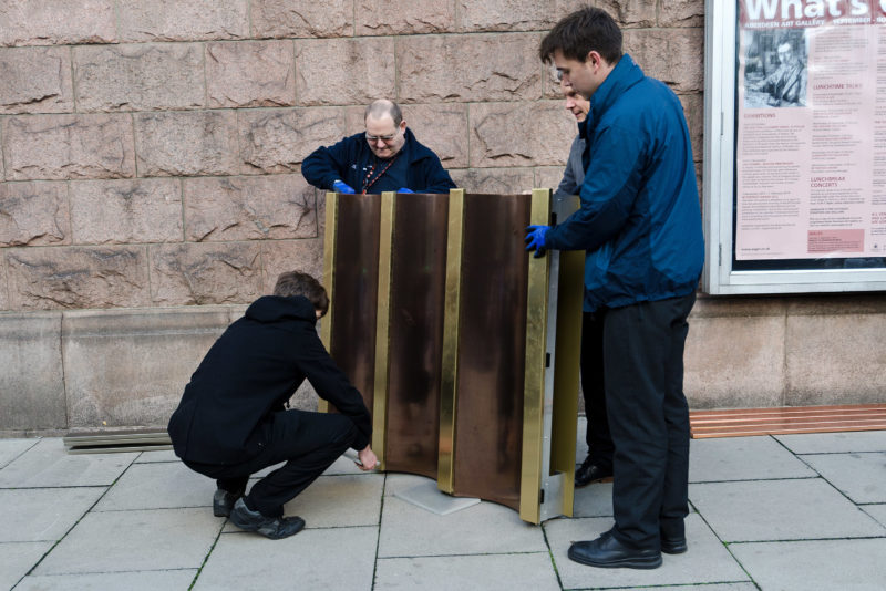
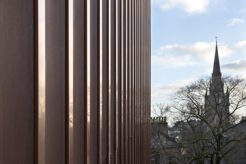
The copper material is selected both as an explicit reference to the ornamental copper domes of the city and for its relationship to the rose tones of the existing granite. While the copper scallops will weather over time, becoming darker and more matt, the pigmented steel caps will retain their brightness, suggesting the idea of a polished or rubbed edge. It is hoped that this new, characterful and enigmatic contribution to the city’s skyline signals the renewal of the institution itself.
